I'm so excited to welcome you all to the first block release day of the Community Sampler sew-along!
I shared last week that my talented friend and fellow Art Gallery Fabrics designer Sharon Holland and I have teamed up once again to co-host an exciting community event and we're so exited to get started! There are eleven blocks in our quilt and each Wednesday we'll release a new block PDF or finishing step, share piecing techniques and tips, and provide inspirational photos as Sharon and I make our own Community Sampler quilts!

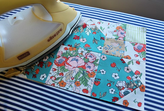
Today's PDF is for our very first block -- Kitty Corners. The block instructions come complete with cutting information and step-by-step illustrations. Be sure to visit Sharon's blog today for additional tidbits and tips for how she makes perfect Quick-Corner Units!
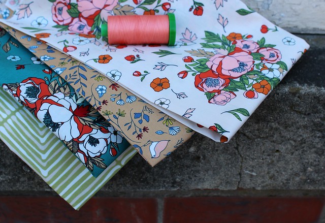
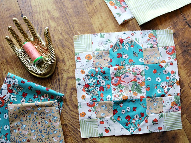
For my own Kitty Corners block I'm using four prints from my Love Story collection -- Soulmate Blooms Cream, Love Birds Amber, Soulmate Blooms Teal and Darling Echoes Vert. (affiliate links)
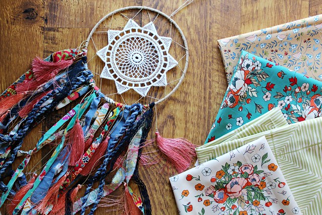
I want my Community Sampler to be colorful and have that boho style that I love so much, so I'm using lots of color and lots of florals! You can see my post where I shared my inspiration images and fabric plans right HERE!
My biggest challenge for this year's sew-along will be my photography. This Fall I moved out of my home sewing room and into a two-room studio just off the main street in town. It's been such a blessing to me, my family and my work! If your interested in following along, you can often catch me sharing videos from the studio in my Instagram stories. For five plus years I had a home sewing room with great natural lighting that allowed me to share pretty photos without much effort. Now, I'm working in a studio that has a drop ceiling full of fluorescent office lights with only a glass door and one large window for natural light. I do have my sewing table positioned so I make the most of the natural light, but still I'm feeling the growing pains of this move when it comes to getting good photos to share here on the blog!
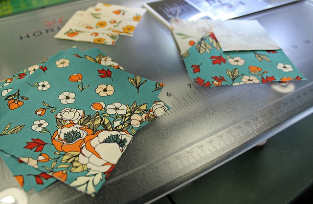
This past Sunday I moved my fabric stash shelf to a different wall in my studio so I can have a second wall with good lighting to use for my fabric collection studio displays. While I wait for my rolls of Flower Child, my upcoming AGF collection to arrive later this month, for the very first time EVER I have a little design wall!
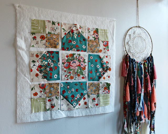
I simply tacked to the wall a 20" square cut of cotton batting that I had precut for a pillow that I need to make and used it as a little design wall to hold each piece as I cut and stitched my Community Sampler block together. Rather than a design wall it will be great to have more as a "memory wall" for me to see exactly what I need to work on each day to keep me focused. I'm so good at getting distracted in my new space. There's just so much that I want to do each day, it's been wonderful for my creativity!
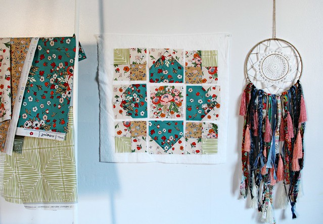
Today, I'd love to know which studio photo you think is best?
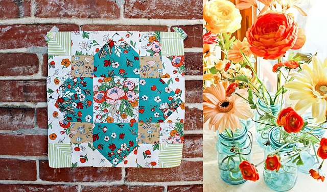
I took one block photo against the building brick...
and a second photo of Kitty Corners against the painted wood door...
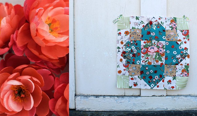
What do you think? Both pictures are so different for me! I've always taken block photos as flat lays against the pretty wood floors in my sewing room at home, so this feels very new! Sharon inspired me to add a pretty flowery image next to each block to give them a little life and I agree, it really did.
I was so unsure about these studio photos that I ended up bringing everything home to photograph again! It's just such a habit for me to photograph everything against my wood floor with the sunlight streaming in!
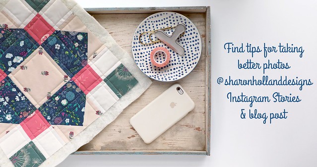
Thanks in advance for the studio photography feedback! Sharon has been sharing in her IG Stories so much wonderful information on quilt photography. She has a passion for it, a great style and is full of information, so be sure to follow her Instagram if you're in need of a little extra help, like ME! Today Sharon will be giving a tutorial in her stories on how she takes such perfect flat lay photos of her blocks. I'm really looking forward to it!
I can’t wait to see what your Kitty Corners block looks like! When you share be sure to add a link to where I can see it below within the comments. When you share on Instagram don’t forget to use the hashtag #CommunitySampler and to tag @sharonhollanddesigns and myself @maureencracknell so we can visit and see your work!
Using #CommunitySampler hashtag will also automatically enter you in the weekly IG Giveaway pool! Remember that your Instagram account does need to be a public account for your post to show up in the Instagram hashtag pool. But please don't worry, if you don't have Instagram we will also be hosting the same giveaway prize, alternately between Sharon's and my blog, so you can choose how and where to enter each week!
Be sure to check back here on Friday for more info on this week's Community Sampler Giveaway with our sponsor Lady Belle Fabrics! Thanks again for joining us!
Happy sewing, friends! xo Maureen
I shared last week that my talented friend and fellow Art Gallery Fabrics designer Sharon Holland and I have teamed up once again to co-host an exciting community event and we're so exited to get started! There are eleven blocks in our quilt and each Wednesday we'll release a new block PDF or finishing step, share piecing techniques and tips, and provide inspirational photos as Sharon and I make our own Community Sampler quilts!

Today's PDF is for our very first block -- Kitty Corners. The block instructions come complete with cutting information and step-by-step illustrations. Be sure to visit Sharon's blog today for additional tidbits and tips for how she makes perfect Quick-Corner Units!

For my own Kitty Corners block I'm using four prints from my Love Story collection -- Soulmate Blooms Cream, Love Birds Amber, Soulmate Blooms Teal and Darling Echoes Vert. (affiliate links)

I want my Community Sampler to be colorful and have that boho style that I love so much, so I'm using lots of color and lots of florals! You can see my post where I shared my inspiration images and fabric plans right HERE!

My biggest challenge for this year's sew-along will be my photography. This Fall I moved out of my home sewing room and into a two-room studio just off the main street in town. It's been such a blessing to me, my family and my work! If your interested in following along, you can often catch me sharing videos from the studio in my Instagram stories. For five plus years I had a home sewing room with great natural lighting that allowed me to share pretty photos without much effort. Now, I'm working in a studio that has a drop ceiling full of fluorescent office lights with only a glass door and one large window for natural light. I do have my sewing table positioned so I make the most of the natural light, but still I'm feeling the growing pains of this move when it comes to getting good photos to share here on the blog!

This past Sunday I moved my fabric stash shelf to a different wall in my studio so I can have a second wall with good lighting to use for my fabric collection studio displays. While I wait for my rolls of Flower Child, my upcoming AGF collection to arrive later this month, for the very first time EVER I have a little design wall!

I simply tacked to the wall a 20" square cut of cotton batting that I had precut for a pillow that I need to make and used it as a little design wall to hold each piece as I cut and stitched my Community Sampler block together. Rather than a design wall it will be great to have more as a "memory wall" for me to see exactly what I need to work on each day to keep me focused. I'm so good at getting distracted in my new space. There's just so much that I want to do each day, it's been wonderful for my creativity!

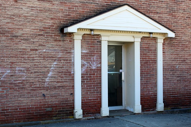
When it came time to photograph my finished Kitty Corners block I headed outside to try a few different options. Because I haven't even begun to tackle the entrance to my studio, I thought today I would share a before shot with all of you. It's pretty rough, especially now that I notice the number 75 graffiti, haha! This is the side of the building that gets the best light for snapping photos, and all I've done is clean the door and put working lightbulbs into the fixtures.
This Summer we plan to fix the door, scrub the brick, paint the wood, hang a sign and of course I'd love to have some potted flowers and a little bench just outside the door!
Today, I'd love to know which studio photo you think is best?
I took one block photo against the building brick...

and a second photo of Kitty Corners against the painted wood door...

What do you think? Both pictures are so different for me! I've always taken block photos as flat lays against the pretty wood floors in my sewing room at home, so this feels very new! Sharon inspired me to add a pretty flowery image next to each block to give them a little life and I agree, it really did.
I was so unsure about these studio photos that I ended up bringing everything home to photograph again! It's just such a habit for me to photograph everything against my wood floor with the sunlight streaming in!

Thanks in advance for the studio photography feedback! Sharon has been sharing in her IG Stories so much wonderful information on quilt photography. She has a passion for it, a great style and is full of information, so be sure to follow her Instagram if you're in need of a little extra help, like ME! Today Sharon will be giving a tutorial in her stories on how she takes such perfect flat lay photos of her blocks. I'm really looking forward to it!

I can’t wait to see what your Kitty Corners block looks like! When you share be sure to add a link to where I can see it below within the comments. When you share on Instagram don’t forget to use the hashtag #CommunitySampler and to tag @sharonhollanddesigns and myself @maureencracknell so we can visit and see your work!
Using #CommunitySampler hashtag will also automatically enter you in the weekly IG Giveaway pool! Remember that your Instagram account does need to be a public account for your post to show up in the Instagram hashtag pool. But please don't worry, if you don't have Instagram we will also be hosting the same giveaway prize, alternately between Sharon's and my blog, so you can choose how and where to enter each week!

Be sure to check back here on Friday for more info on this week's Community Sampler Giveaway with our sponsor Lady Belle Fabrics! Thanks again for joining us!
Happy sewing, friends! xo Maureen

Such beautiful fabrics!!! I like the brick wall shot, and part of that may be because of the flowers in mason jars that you paired with it! I also love your sunny wood floors☺️
ReplyDeleteI agree, I don't think I'll figure out anything better than what I have here at home. It's such great lighting! I guess we'll see how long I can cart things back and forth before it gets annoying! :)
DeleteGRACIAS POR COMPARTIR, BENDICIONES DESDE VENEZUELA...
ReplyDeleteI think your blocks look great against any backdrop but the brick backdrop really makes the colors pop for me. How exciting to have a real studio. :o)
ReplyDeleteThank you! That's two votes for brick, hooray!! I did bring everything I made today, home to photograph once again. This old habit is going to die hard for sure!
DeleteOh goodie oh goodie. I am ready.
ReplyDeleteI love the block. Against the brick the block looks sweet. All of the colors compliment each other, (great flower arangements on the side too btw) and on the door, it is beautific, but the back ground is kind of washed out -- even though it is pretty.
These are great photo tips. Thanks for sharing this. I usually take a terrible photo of my block and never know why it turns out so sad haha
I will take these examples in consideration, so thank you for that.
I would love to loiter outside your studio haha, j/k but I do with I was close by.
That's three votes for the brick, yippee! And, I would definitely invite you in! I get so lonely, but haven't opened up for visitors because I am just so busy each day!
DeleteI'm so happy you are joing us!! :)
Absolutely beautiful block, those fabrics are gorgeous together! I love the brick shot and the floor shot, but think the brick shot really brings out the colours x
ReplyDeleteThanks for chiming in! Yours and the other votes for brick really means so much to me, you've really helped me out! I'm happy with the block, too. It's a little busy but I'm not steering away from that this time, especially with the florals!
DeleteI love the florals. I am Native American, Chippewa, we love flowers and bright colors. I went out shopping for some yesterday in Salt Lake City, Utah with no luck, so today I am ordering from your collection. I will also be using some of your designs to make my granddaughters regalia dress for her dancing at pow wows.
ReplyDeleteI just want to jump in and scoop up every one of these! The colors are just stunningly beautiful! We have a faux brick wall in our dining room and would be the perfect backdrop for these colors!
ReplyDeleteThe handbags are just gorgeous!
Hi thanks for the chance to enter this gorgeous giveaway, I am runnerbean66 on Instagram following you, sue Jewison on Facebook liking you xx
ReplyDeleteI followed on facebook
ReplyDeleteLisa Vanhook