
After sharing the photos of my Fleet & Flourish yardage Monday, I stood in front of my rolls feeling overwhelmed in the very best way. Looking at that much fabric, with limitless possibilities, was making it all the more difficult for me to decide on just. one. quilt plan. Then I thought of all the traditional quilts that have caught my eye over the past few weeks, vintage and thrifted, being used as holiday decor by many of the home design bloggers I follow on Instagram, layered onto the foot of a bed, draped over a sofa, re-purposed into stockings. Almost all of them comprised of HSTs (half square triangles) and so that's where I began.
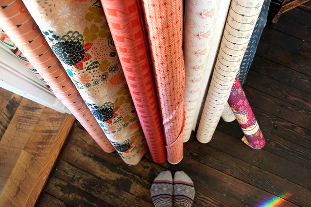
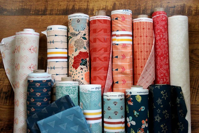
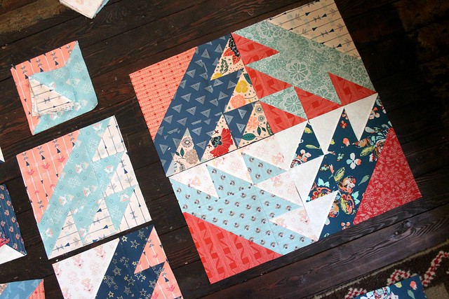
I pulled my Fleet & Flourish rolls in cream + peach + coral and those in aqua + blue, adding in a little Wild & Free and a couple Prisma Elements to make eight prints in each color assortment.
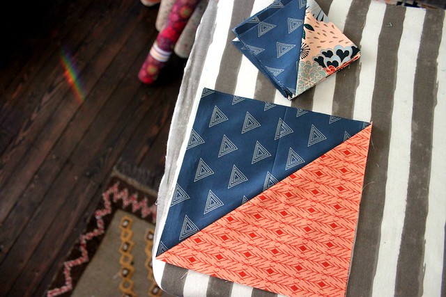
When it comes to making HSTs, my go-to has always been the method used for making eight at a time. It's fast, efficient, and I find making them fun! For this quilt I started with two 9" squares in contrasting colors to yield eight 4" HST after trimming. I played around with block pattern ideas and decided to join my little HSTs with one larger 7.5" HST to create my quilt block.
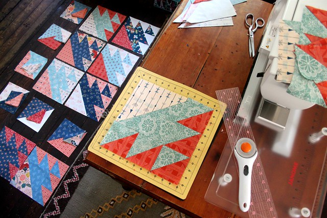
After sharing a snapshot of my work on Instagram, assuming I didn't just stumble upon a brand new block design, I asked if anyone recognized the pattern. Soon someone shared that this block is called the Lost Ship block and a quick Google search lead me to it's many beautiful variations.
Before all of that I had finished just enough to play around with block arrangement and took a couple photos to share before deciding. This first one I really love! I wouldn't necessarily put these exact four blocks together, but I like the pattern that emerges.
This photo below shows the additional design and large diamond that will form if I join my blocks this way. While I love the look in the photo above, I'll be tempted to add in a little more pattern to break up this big diamond. Most likely more of the blue and aqua prints to form a smaller center diamond.
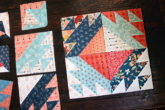
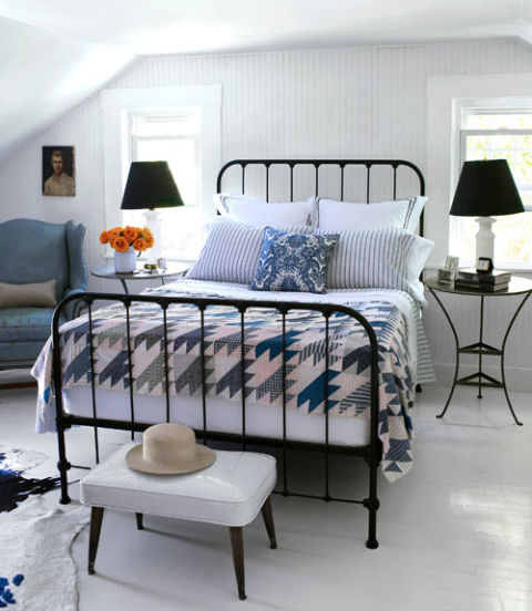
Then, this morning on Instagram I see this photo re-shared from Country Living and notice the very same pattern I'm sewing up! Keeping the blocks arranged like this isn't an option I gave much thought to -- until now, I love it!!
My blocks look to be a little larger at 11" unfinished, but I'd still have to make MANY more to finish a quilt in this pattern!
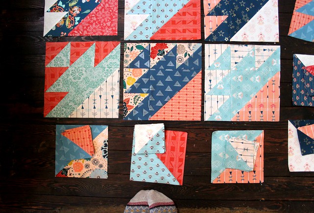
I'm twenty four blocks in right now, which might be just enough for a new top, depending on which layout I choose, if I add in sashing, etc..
SO... I have to ask, which would you choose?
I pulled my Fleet & Flourish rolls in cream + peach + coral and those in aqua + blue, adding in a little Wild & Free and a couple Prisma Elements to make eight prints in each color assortment.
When it comes to making HSTs, my go-to has always been the method used for making eight at a time. It's fast, efficient, and I find making them fun! For this quilt I started with two 9" squares in contrasting colors to yield eight 4" HST after trimming. I played around with block pattern ideas and decided to join my little HSTs with one larger 7.5" HST to create my quilt block.
After sharing a snapshot of my work on Instagram, assuming I didn't just stumble upon a brand new block design, I asked if anyone recognized the pattern. Soon someone shared that this block is called the Lost Ship block and a quick Google search lead me to it's many beautiful variations.
Before all of that I had finished just enough to play around with block arrangement and took a couple photos to share before deciding. This first one I really love! I wouldn't necessarily put these exact four blocks together, but I like the pattern that emerges.
This photo below shows the additional design and large diamond that will form if I join my blocks this way. While I love the look in the photo above, I'll be tempted to add in a little more pattern to break up this big diamond. Most likely more of the blue and aqua prints to form a smaller center diamond.
Then, this morning on Instagram I see this photo re-shared from Country Living and notice the very same pattern I'm sewing up! Keeping the blocks arranged like this isn't an option I gave much thought to -- until now, I love it!!
My blocks look to be a little larger at 11" unfinished, but I'd still have to make MANY more to finish a quilt in this pattern!
I'm twenty four blocks in right now, which might be just enough for a new top, depending on which layout I choose, if I add in sashing, etc..
SO... I have to ask, which would you choose?
I actually really like the second layout, with the large triangles arranged in a diamond. And, I can visualize what it would look like with a blue center, but I think you might lose the impact of the original pattern.
ReplyDeleteI like #2...where the big triangles meet in the middle.
ReplyDeleteOk, so here's what I think. If you make the first option and put together a 4-block :block", by not adding a shashing in between the larger "blocks", you will end up seeing option number 2 also. If you put shashing, you will separate them, so you will not see the block option number 2 as clear. This goes the other way round too, if you put them together as option 2, you will accidentaly do option 1 too. Option 3, by laying them in one direction is a complete different story. When you have at least 16 blocks, try all options to see what happens and let us know!!! They all look amazing anyway. If I had enough fabric and time, would try all variations. You could do the 4=block patches in the main body of the quilt, and the one direction as borders.
ReplyDeleteYes, exactly! I was trying to say that number 2 is the additional design that is formed when the blocks are put together in this way, but I think I need to reread and rewrite that because I wrote that it's the alternate layout! Haha! I love the look of the design that emerges in photo 1 but not as much in photo 2, so I would possibly add blue to each corner or if I went with sashing it could change that for me completely! I'm looking forward to reading which direction others would take, thanks!
DeleteI am with Eleni. You will get both options when you do layout #2. It might be cool to see what that looks like before moving on and that might just answer the question at hand. Although I do like the layout #3 - maybe a second quilt is instore for you! Love this fabric as I do ALL of what you have produced! You are an amazing design artist with your fabric.
ReplyDeleteI like the pattern with the little HSTs in the center and the big ones on the outside - it reminds me of broken dishes. However, I agree that it might be a concern with the colors and prints that you've already sewn up, getting them to play nice together! I would love to see what you already have done laid out like the bed quilt pictured. Sometimes traditional is just the way to go!
ReplyDeleteI also like the second one best. There would be fewer matching points with this option and I think for myself a smashing around so there again would be fewer matching points. I luv to see all points matched....a little anal I am. I just luv your fabric and these choices.
ReplyDeleteMy first thought, before even seeing your layouts, was all going the same direction, like the Country living photo...still like it best, and also wondered what it might look like if you alternated direction by row...anything? It is a beautiful fun HST wonderful block! Gorgeous in your rich fabrics!
ReplyDeleteThe good news is, you can't go wrong! Gorgeous fabrics!!
ReplyDeleteHappy New Year Maureen! Your fabrics are soooooo beautiful! Difficult decision; I really like both patterns. This block is really good and you inspire me to make a quilt with this block! I think I would try adding the small square in the middle of the big diamond as you said. x Teje
ReplyDeletePS. my new address is www.nerospostbox.wordpress.com
I also love the 2nd photo. Can't wait to see what you decide.
ReplyDeleteI love the first option also! The House and Home option is nice but it's a little calmer of a colour palette...so hard to pitcure. A photo of your blocks in that layout would be helpful in deciding! lol.
ReplyDeleteGosh, I love it both ways. SO great to see all those rolls of your fabric!
ReplyDeleteWhat if you rotate the two opposite corners so two are point in and two are pointing out? If not that then I like the idea of laying them all out like the bottom picture?
ReplyDeleteI'm loving the one with the bigger square ~ there's something about it that's so attractive to me. Love your new line!
ReplyDeleteI like the layout on the bed the best, as it would bring a little order to the scrappy blocks.
ReplyDeleteI prefer the block layout you decided on before seeing the Instagram image. It's much more "you"!
ReplyDeleteHappy New Years. I agree with that fabric anything is going to be gorgeous. But since I get to have an opinion, I love the one from country living. It looks most like a ship and my husband was in the navy so I think that's why I'd pick it.
ReplyDeleteI like the second one best ,the one with bigger squares in the center.Yummiest fabric line,have fun playing with then.Happy sewing!
ReplyDelete#1 but I would make sure it didn't turn into # 2- whatever you have to do to get it there
ReplyDeleteI'm in love with this pattern you chose to go with your fabric. Very inspiring!!
ReplyDeleteI love the second option the best. I just think it is beautiful with those large triangles in the center.
ReplyDeleteI like your arrangement and your idea to do a smaller diamond in the center to break up the larger squares that will emerge. Love your new line, whatever you decide will look amazing!
ReplyDeleteI actually like the last one; the one seen on the bed in the blues. There's so much going on already with the many different prints and colors, that you don't really need to add a whole lot of action by having the blocks rotate. Looking forward to see what you choose!
ReplyDeleteBeautiful fabric. I like the blocks with the large diamond in the middle as is.
ReplyDeleteLove your fabric collection, it reminds me of beautiful rolls of wallpaper. For me, I would go with photo number 2. I think it really shows off the gorgeous fabrics.
ReplyDeleteI really like the layout on the bed quilt in the final photo. But it has a lot of neutrals. Have fun!
ReplyDeleteI prefer picture one...........your own design. The one on the bed reminds me of the "bear paw" design which I really don't like.
ReplyDeleteAbsolutely love the pattern. The fabrics look beautiful.
ReplyDeleteI like options one and two -- two halves of a piece, but I'd like more than 24 blocks, which is actually only six "large" blocks or two by three, and I think that arrangement would feel unfinished to me. I do like your idea of adding something of interest to the centers of the large formed squares (#2). One thing I don't like is when the values aren't consistent among the blocks -- the one with the dark (red/orange) in the large triangle sticks out as out of place, when the others have the medium value in that triagle and the dark in the center of the block and the insides of the smaller squares (hope that makes sense). I so love your fabrics, though, that I think you could make anything with them and it would be tremendous.
ReplyDeleteI said that backwards. I meant the dark orange/red to the outside of the small triangles instead of the other way around. In most of your other blocks, your darkest value is toward the center of each block. Medium/dark for the large square and dark/light for the small squares.
ReplyDeleteThird time's the charm, I hope. As I keep going back to those blocks, I like the one with the dark red in the outside of the small triangle squares the best alone, and as I look at Option #1, I'd like the meta-design if all of the outer small triangles (toward the center) were dark. Agree that the counter view in Option 2 needs something more in the center. A dark counterweight if the mediums and lights make the diagonal and the large outer triangle. Or reverse the values. But make that central image in Option 1 stand out, either way.
ReplyDeleteBTW, love your socks. They very nearly match the fabric!
ReplyDeleteI like your first choice, for these fabrics. The Country Living one is nice but the palette is more limited and I think that's why it works.
ReplyDeleteJust beautiful. Love it and the fabric as well.
ReplyDeleteEverything is very open and very clear explanation of issues. was truly information. Your website is very useful. Thanks for sharing.
ReplyDeleteGreat article and right to the point. I don’t know if this is in fact the best place to ask but do you people have any ideea where to employ some professional writers? Thank you
ReplyDeleteThis blog has a lot of friendliness and a warm welcome
ReplyDeletethank you very much
ninest123 16.03
ReplyDeletelongchamp outlet, uggs on sale, uggs on sale, uggs outlet, oakley sunglasses, louboutin uk, nike air max, louis vuitton outlet, michael kors outlet, louis vuitton handbags, nike free, tiffany jewelry, michael kors outlet online, tiffany jewelry, michael kors outlet online, replica watches, oakley sunglasses, oakley sunglasses, ray ban sunglasses, cheap jordans, nike air max, louis vuitton outlet online, oakley sunglasses, burberry outlet, ralph lauren outlet, christian louboutin, uggs outlet, michael kors, burberry factory outlet, ralph lauren polo, christian louboutin, ray ban sunglasses, michael kors handbags, gucci handbags, replica watches, longchamp outlet, prada outlet, tory burch outlet, louis vuitton outlet, cheap oakley sunglasses, uggs on sale, louboutin shoes, prada handbags, longchamp bags, nike outlet, louis vuitton, michael kors outlet online, ray ban sunglasses
michael kors outlet online, polo ralph lauren uk, ralph lauren pas cher, nike air max, michael kors uk, hermes pas cher, true religion outlet, true religion jeans, polo lacoste pas cher, coach purses, coach outlet store online, north face pas cher, lululemon outlet, true religion outlet, lunette ray ban pas cher, hogan sito ufficiale, nike blazer pas cher, nike roshe uk, michael kors, timberland pas cher, nike air max pas cher, true religion outlet, burberry pas cher, nike roshe run pas cher, lunette oakley pas cher, nike tn pas cher, nike air max uk, abercrombie and fitch, nike air force, new balance, jordan pas cher, replica handbags, north face uk, ray ban uk, michael kors, nike air max uk, sac guess pas cher, converse, hollister uk, vans pas cher, louboutin pas cher, longchamp soldes, longchamp pas cher, nike free pas cher, mulberry uk, coach outlet, nike free, vanessa bruno pas cher, abercrombie and fitch UK
ReplyDeletepandora charms, moncler jackets, toms shoes, swarovski uk, moncler uk, barbour, replica watches, canada goose, marc jacobs, links of london uk, supra shoes, louis vuitton uk, converse shoes outlet, moncler outlet, swarovski jewelry, canada goose outlet, coach outlet, moncler pas cher, ugg pas cher, thomas sabo uk, canada goose outlet, louis vuitton, sac louis vuitton, moncler, barbour jackets uk, juicy couture outlet, pandora jewelry, montre pas cher, canada goose jackets, ugg,uggs,uggs canada, moncler, canada goose jackets, louis vuitton, ray ban, hollister, ugg,ugg australia,ugg italia, canada goose uk, bottes ugg pas cher, moncler, juicy couture outlet, canada goose pas cher, sac louis vuitton, lancel, pandora jewelry, moncler, ugg uk, wedding dresses uk, karen millen uk, pandora uk, canada goose, gucci
ReplyDeleteninest123 16.03
Great work! This is the type of info that should be shared around the internet. Shame on the search engines for not positioning this post higher! Come on over and visit my site . Thanks
ReplyDeletenike outlet store online
ReplyDeletedior outlet
louis vuitton outlet
true religion jeans
abercrombie outlet
cheap oakley sunglasses
fitflops clearance
lebron james shoes
true religion outlet
tods shoes sale
ralph lauren pas cher
swarovski crystal
air max 90
true religion jeans
ralph lauren shirts
louis vuitton bags
fitflop sale
true religion outlet uk
rolex watches
louis vuitton sunglasses
air jordan shoes
coach outlet
fitflops sale
chaussure louboutin
michael kors handbags
swarovski outlet
michael kors online
coach outlet online
polo outlet
omega watches
oakley sunglasses uk
ray ban sunglasses sale
nike store uk
coach outlet online
jordan pas cher
chanyuan0715
color choises look absolute dreadful....................
ReplyDeleteeagles coats are the perfect blend of style and team spirit for any true fan. Designed for comfort and durability, these coats keep you warm while showcasing your support. Whether at the stadium or around town, eagles coats make a bold statement with their iconic design and unbeatable fan pride.
ReplyDelete