Thank you all for your input on my Lost Ship post from last week, as always, your comments were incredibly helpful. These days, due to a nasty cold I've had since New Years, I'm working much slower than I'd like. I had hoped to have a finished quilt top by now, but instead I'm here again today with more options to share! After taking the photos that I blogged last week, I continued with making blocks until I had twenty four, a much better amount to play with layout choices. I knew right away that regardless which one I chose, I'd need to make quite a few more blocks to create a balanced quilt. To help me determine just how many, I started experimenting, using both straight and on-point settings and discovered several possible variations for each. Still, the two options I mentioned last week were definitely my very favorites. Since many of you mentioned how nice it would be to see more than just the four blocks put together to help you decide, I'm excited to share more of each today. Especially for those of you who mentioned wanting to make these same blocks!
First, I arranged the blocks via the Country Living image.
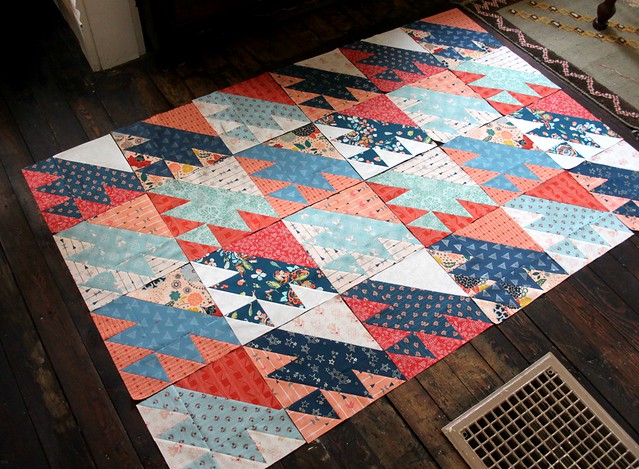
While I like the look and think it would make for a beautiful quilt, allowing each individual print to shine. As the designer of these fabrics, of course a part of me LOVES that! Overall, I think it would have worked much better had I chosen to create my blocks with a consistent light and dark contrast, rather than simply choosing the color combo of cream + peach + coral to pair up with aqua + blue. As mentioned within the comments, I agree that more neutrals and a calmer color palette would work much better with this layout!
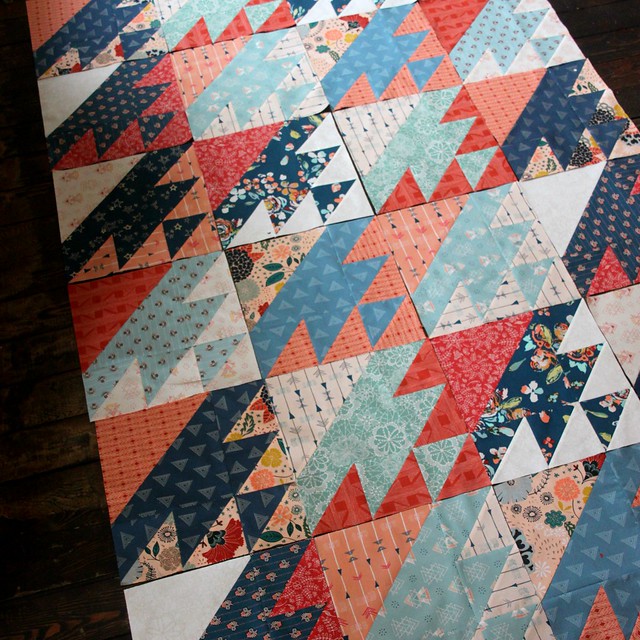
After making my very first block, this next layout is the one I envisioned and is the one that felt the most me.
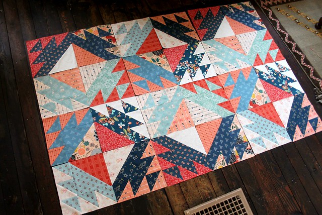
This center pattern that is created when four blocks are placed together is exactly what I had in mind when I started this quilt!
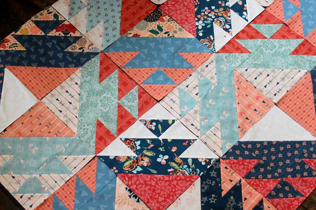
It was the secondary pattern that emerged that I was most unsure about.
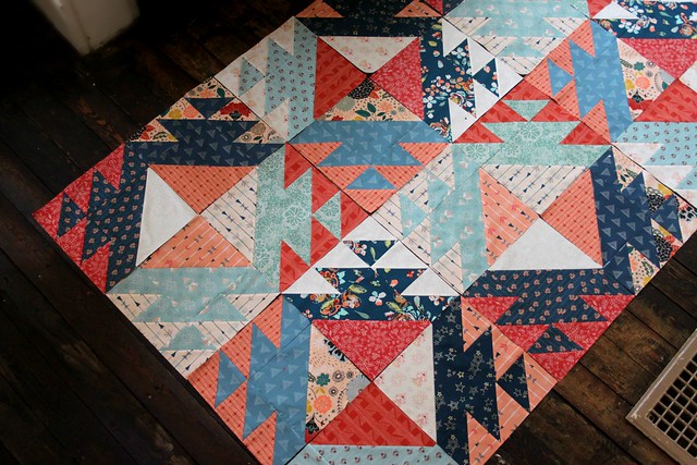
Now this is where I surprised myself and ended up agreeing with the majority of opinions shared last week -- the diamonds or squares that form within this layout are now my very favorite parts of this option! I had mentioned that I would be tempted to add in a little more pattern to break up the big diamonds, most likely by adding in more of the blue and aqua prints to form smaller center diamonds.
Well, I was wrong!
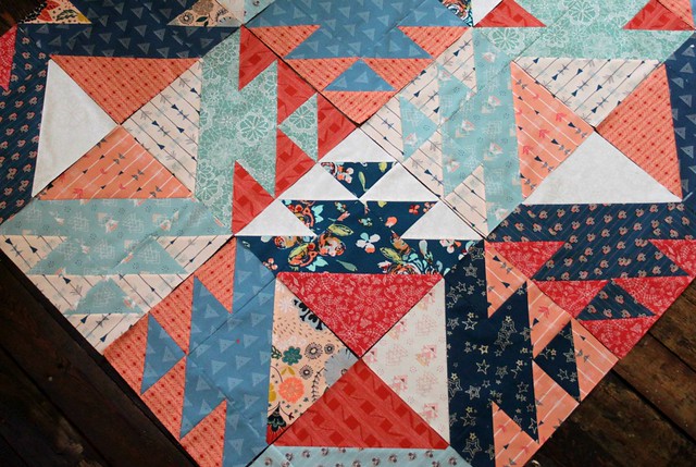
Over the weekend I made twelve more Lost Ship blocks to add one more final row. Before I sew them together to finish up my quilt top I have to work on the symmetry and balance within this quilt layout, but I really love it!
How about you? Now that I've shared more, which option do you prefer?
First, I arranged the blocks via the Country Living image.

While I like the look and think it would make for a beautiful quilt, allowing each individual print to shine. As the designer of these fabrics, of course a part of me LOVES that! Overall, I think it would have worked much better had I chosen to create my blocks with a consistent light and dark contrast, rather than simply choosing the color combo of cream + peach + coral to pair up with aqua + blue. As mentioned within the comments, I agree that more neutrals and a calmer color palette would work much better with this layout!

After making my very first block, this next layout is the one I envisioned and is the one that felt the most me.

This center pattern that is created when four blocks are placed together is exactly what I had in mind when I started this quilt!

It was the secondary pattern that emerged that I was most unsure about.

Now this is where I surprised myself and ended up agreeing with the majority of opinions shared last week -- the diamonds or squares that form within this layout are now my very favorite parts of this option! I had mentioned that I would be tempted to add in a little more pattern to break up the big diamonds, most likely by adding in more of the blue and aqua prints to form smaller center diamonds.
Well, I was wrong!

Over the weekend I made twelve more Lost Ship blocks to add one more final row. Before I sew them together to finish up my quilt top I have to work on the symmetry and balance within this quilt layout, but I really love it!
How about you? Now that I've shared more, which option do you prefer?

I love your fabric...Fleet and Flourish. I am drawn to the first picture. As, I feel that is more movement. But, it is really interesting how the pattern comes together in the second picture. Just me. You are great! Susie
ReplyDeleteI luv the secondary pattern too. You have a great eye
ReplyDeleteI like the second option, like the second pattern that comes out and the fabrics pop out for me.
ReplyDeleteFunny - I didn't even see the secondary pattern you were first in love with until you just mentioned it in this blog. All I saw was the other secondary pattern of large square/diamond shapes and I really liked how it came together. And the last design really is you, no question!
ReplyDeleteHi Maureen! Now this gets much more difficult! I can't decide which I like best, but I think I prefer the second one with the secondary pattern because that is really good! I could use this for a baby quilt I need to make soon, but I'm not sure if I can plan the colours well enough. Thank you for sharing your options and thoughts. x Teje
ReplyDeleteI love the second option. So much to look at, it will never get old or boring. Of course the fabrics help with that as well! I agree with you also that the second one is more "you". Very MCH. I can't wait to see it sewn together!
ReplyDeleteIt's gorgeous, being able to see more blocks together made me change my mind on the country living design. I really love the fabric and that diamond in the center is really striking. I can't get over how much you get done even with a cold. I'm still working on the herringbone quilt that was a Christmas gift. I'm to the point of being panicked about putting the back on it. It's always where I get stuck.
ReplyDeleteI prefer the second option as well. While I do like the Country Living layout, I concur that it requires a bit more color control to achieve the effect of CL's two color option. Beautiful fabrics either way!!!!
ReplyDeleteI can't pick, I love them all! You accomplish a bunch more than I do with a cold, lol.
ReplyDeleteThis is beautiful! I love your second layout.
ReplyDeleteFor my eye the second (original) layout has more rhythm to it. It moves the eye along, but also allows it to rest. The first layout(Country Living) is very sparkly with the way you chose fabrics for your blocks, This can be very energetic, but also hard to find a focus point.
ReplyDeleteLOVE how it's turning out! It's got this combo Aztec/Americana feel to it. LOVE IT!
ReplyDeleteLove the one with the center pattern the best--hugs, Julierose
ReplyDeleteThis is stunning! I love your second layout with the big squares in the center.
ReplyDeleteDear Maureen! Beautiful are two variants of your new quilt. But the second option I like much more, and besides, is the more "your". Happy New Year from Poland! :)
ReplyDeleteI really like what you ended up going with! Its a wonderful layout, look and of course beautiful fabric!
ReplyDeleteThis is a great look!
ReplyDeleteLike the second option!
ReplyDeleteI think you are going to have to make more than one quilt using these blocks--lol!
ReplyDeleteThe second!! Love the secondary pattern. This just shows how completely different a quilt can look with a different layout or with different color/value placement. This is going to be beautiful!
ReplyDeleteHi Maureen !!!
ReplyDeleteI love both the patterns and the fabrics you chose are perfect for this Bloch!
But...if I have to choose one...I choose the second one!
Great job!!!!
Dany
Looks wonderful, love your layout.
ReplyDeleteLove this~beautiful colors!
ReplyDeleteYour version for sure! Love it. Love the fabric
ReplyDeleteGreat work! I really like your version best! I love the secondary patterns that jump out :)
ReplyDeleteDebby E
samtaylorcjsmimi at yahoo dot com
I definitely like the second option. Have you tried putting 4 light blue ships together to make a light blue secondary square of triangles alternating with 4 dark blue ship blocks? Do you know what I mean?
ReplyDeleteI definitely like the second option. Have you tried putting 4 light blue ships together to make a light blue secondary square of triangles alternating with 4 dark blue ship blocks? Do you know what I mean?
ReplyDeleteIn this most recent version I feel like the dark bits are creating a sort of unorganized abstract line that doesn't seem organic.
ReplyDeleteI actually like the original Country Living layout best. It just seems to allow the fabrics to shine.
ReplyDeleteLoved the secondary pattern. Love it.
ReplyDeleteMaureen, do you have a pattern for this? I am wondering what size squares you cut? And what size was the finished block? And if you would be willing to share it> I've looked under Lost Ships and I cannot find directions, only pictures.
ReplyDeleteWonderful beat ! I would like to apprentice while you amend your site, how can i subscribe for a blog web site? The account aided me a acceptable deal. I had been a little bit acquainted of this your broadcast offered bright clear concept.
ReplyDeleteIt's amazing when you find a good content in today's internet.
ReplyDeleteSuper ! Ton blog est vraiment génial !
ReplyDeleteMerci d’exister !!!
voyance gratuite mail
Great article and right to the point. I don’t know if this is in fact the best place to ask but do you people have any ideea where to employ some professional writers? Thank you
ReplyDeleteninest123 16.03
ReplyDeletelongchamp outlet, uggs on sale, uggs on sale, uggs outlet, oakley sunglasses, louboutin uk, nike air max, louis vuitton outlet, michael kors outlet, louis vuitton handbags, nike free, tiffany jewelry, michael kors outlet online, tiffany jewelry, michael kors outlet online, replica watches, oakley sunglasses, oakley sunglasses, ray ban sunglasses, cheap jordans, nike air max, louis vuitton outlet online, oakley sunglasses, burberry outlet, ralph lauren outlet, christian louboutin, uggs outlet, michael kors, burberry factory outlet, ralph lauren polo, christian louboutin, ray ban sunglasses, michael kors handbags, gucci handbags, replica watches, longchamp outlet, prada outlet, tory burch outlet, louis vuitton outlet, cheap oakley sunglasses, uggs on sale, louboutin shoes, prada handbags, longchamp bags, nike outlet, louis vuitton, michael kors outlet online, ray ban sunglasses
michael kors outlet online, polo ralph lauren uk, ralph lauren pas cher, nike air max, michael kors uk, hermes pas cher, true religion outlet, true religion jeans, polo lacoste pas cher, coach purses, coach outlet store online, north face pas cher, lululemon outlet, true religion outlet, lunette ray ban pas cher, hogan sito ufficiale, nike blazer pas cher, nike roshe uk, michael kors, timberland pas cher, nike air max pas cher, true religion outlet, burberry pas cher, nike roshe run pas cher, lunette oakley pas cher, nike tn pas cher, nike air max uk, abercrombie and fitch, nike air force, new balance, jordan pas cher, replica handbags, north face uk, ray ban uk, michael kors, nike air max uk, sac guess pas cher, converse, hollister uk, vans pas cher, louboutin pas cher, longchamp soldes, longchamp pas cher, nike free pas cher, mulberry uk, coach outlet, nike free, vanessa bruno pas cher, abercrombie and fitch UK
ReplyDeletepandora charms, moncler jackets, toms shoes, swarovski uk, moncler uk, barbour, replica watches, canada goose, marc jacobs, links of london uk, supra shoes, louis vuitton uk, converse shoes outlet, moncler outlet, swarovski jewelry, canada goose outlet, coach outlet, moncler pas cher, ugg pas cher, thomas sabo uk, canada goose outlet, louis vuitton, sac louis vuitton, moncler, barbour jackets uk, juicy couture outlet, pandora jewelry, montre pas cher, canada goose jackets, ugg,uggs,uggs canada, moncler, canada goose jackets, louis vuitton, ray ban, hollister, ugg,ugg australia,ugg italia, canada goose uk, bottes ugg pas cher, moncler, juicy couture outlet, canada goose pas cher, sac louis vuitton, lancel, pandora jewelry, moncler, ugg uk, wedding dresses uk, karen millen uk, pandora uk, canada goose, gucci
ReplyDeleteninest123 16.03
jianbin0913
ReplyDeletenike outlet online
true religion jeans
beats by dr dre
michael kors outlet
ugg boots on sale
ugg boots
the north face jacket
michael kors outlet
longchamp pliage
ugg clearance
hollister uk
coach outlet store
oakley sunglasses
burberry outlet sale
the north face outlet
chicago blackhawks
polo ralph lauren
ferragamo shoes
lacoste pas cher
michael kors outlet
cartier watches
abercrombie and fitch
ugg boots
tods outlet online
jordan 13
ugg boots
jordan 11
cheap nhl jerseys
mulberry sale
hollister sale
cheap jordan shoes
michael kors outlet online
tods outlet